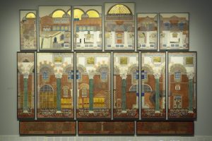
This is the building that blew away everything I thought I knew about decoration and pattern. The Byzantine idea about the dematerialization of space through the use of pattern and gold leaf is awe-inspiring. A Byzantine interior overwhelms the senses and lets you know that you have entered a place that is not of this world. The riot of pattern, texture and gilded surfaces resulted in the first of the drawings to be explicitly about the interior of the building, with just hints of the brickwork and roofline to refer to the rather plain exterior. This drawing is filled with collaged elements from other drawings in the series and embodies the theme of conversation between the drawings of these contemporaneous buildings.
Look for many examples of differing perspectives and views of interior spaces, including the three bottom panels, which represent the much older crypt beneath the present day church.
Some details you might look for include:
- The representation of St. Dimitrios being lowered to his death in the well.
- The green porphyry columns with capitals salvaged from many other buildings.
- The carved wooden screen.
- The chairs for the priests.
- Curtains hiding the silver casket of a donor.
- And the remnants of mosaics – especially the patriarch peeking out from behind a column.

You must be logged in to post a comment.